


Choosing the color
Thoughts and reflections

It may seem trivial but choosing the color of the wedding really helps identify the event one way or the other.
The color is the central idea, what will make you think of the care with which the whole ceremony has been thought through, what will be present in everything that will be realized: floral decorations, wedding favors, mise-en-place, and much more.
Therefore, if the newlyweds choose blue, it goes without saying that it will have to be a not-too-dark shade, so as to include the flowers as well. Or rather, if they choose pink, it won’t surely be a too bright and flashy shade, but something light, elegant. And so forth.
Green gets often chosen, as it’s one of the most versatile colors: pink would give an overly feminine touch, blue would be too masculine, red is nice but you have to be real careful, purple and its shades get usually ruled out as superstition-related, brown doesn’t even deserve explaining, white gets taken for granted but it’s a sort of mandatory choice to help out with the actual color that will get picked.
Within green, though, there’s a whole range of shades. But only one will be picked and stuck to as the wedding color.
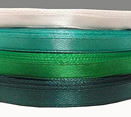
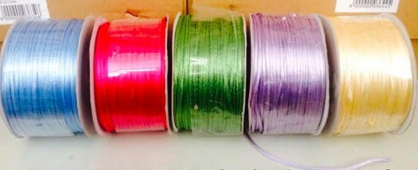
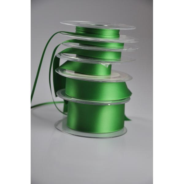
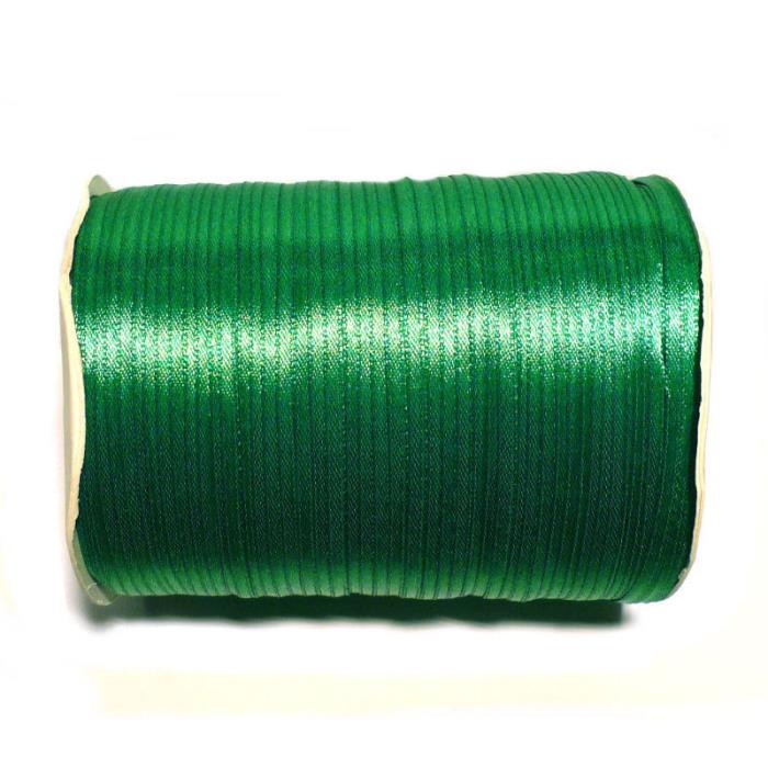
And all ribbons will be that particular color: those on wedding favors, the decorative ones, all of them. Satin ribbons will be the wedding color!
Sometimes, however, couples don’t choose any color.
You know, it’s not really mandatory. Even though a wedding with “character” does have its color. If there’s no color, no big deal, but careful invitee do notice: a no-color event, as much as superbly organized and thought-out, will lack character as all colors will be mixed up together with none of them really standing out.
My recommendation would be to always push for a color of choice, as it gives the impression of something well taken care of in its smallest details and, besides what the invitees might think, the newlyweds will know where to lean towards in any other choice they will have to make. When there’s no wedding color, every time the newlyweds will be called to decide on a given mise-en-place or decoration, for example, they will find themselves back to square one. When there’s a reference color, everything else revolves around it.
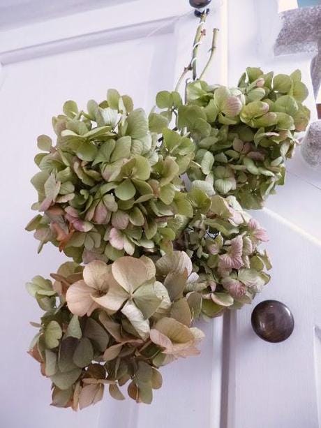
Let’s imagine an early Fall wedding, around these very days, when landscape colors get warmer and the range of green develops so many shades, besides those already there: a red-speckled, burnt green might lend a remarkable tone of warmth.
Dried hortensias, this time of the year, have color tones similar to works of art; so, choosing that type of green and linking floral decorations made of dried hortensias with white fresh flowers might be a great idea.
Floral decorations can even be enriched by the presence of fruit. In these cases we may admire real masterpieces: grapes, green apples, mixed with some hortensias and some white peonies, will grant a touch of exceptional elegance.
Think about it!
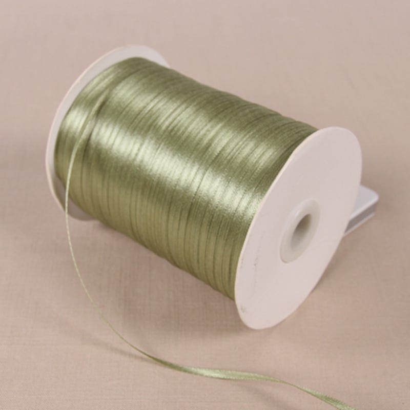
Going on with the choice of green in early Fall, another idea I would suggest to whoever may decide to get married in Central Italy, for example, might be to make wedding favors with green ribbons to recall this time of year’s olive harvest and production of fresh extra virgin olive oil. Such a great idea. What do you think?
So, colors may lend themselves to infinite variations, once you’re convinced that you’ve made the right choice. From that moment on, the whole wedding structure will take a precise direction and the newlyweds will be able to continue their path towards the making of a perfect ceremony, which might be rich and lavish or rather minimal, but, in any case, perfect.
Start thinking about it, and next Sunday we’ll continue with our checklist.
Take care.