


Announcements and Invitations
(part two)

In last Sunday’s issue I started to tackle a rather delicate topic: how to communicate your wedding, i.e., how to invite to and/or announce the big event.
Going for a classic/traditional stance, for the time being I decided to neglect any digital/technological aspects and focus solely on the rules that govern announcements and invitations.
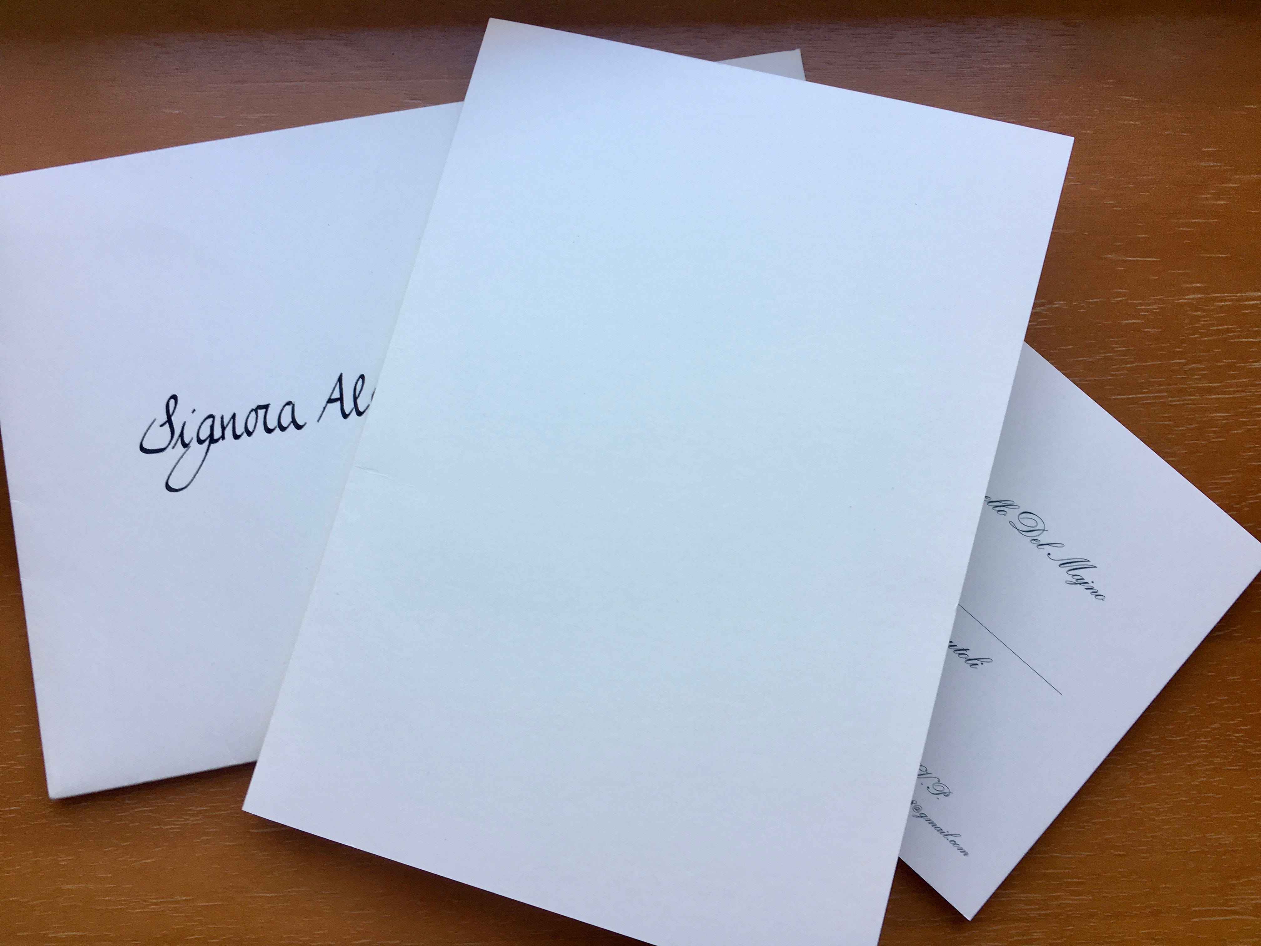
After explaining in detail that the communication includes three parts (envelope, announcement and invitation), or only two (in case of a simple announcement, with no invitation), and that it should be addressed very carefully depending on the status of the recipient (singles, couples or families), here I’d like to discuss about what and how to write on these two pieces of paper.
I often received announcements and invitations with too many words crammed on them, with no respect whatsoever for font proportions, sometimes even with hard-to-understand information (despite the cramming): well, a few simple yet precise rules exist in the tradition of the so-called wedding bon ton, at least here in Italy.
First off, the announcements. They can be drawn up in two ways, for all intents and purposes. Either the parents announcing their children’s wedding, or the children themselves announcing their own wedding. When you receive an announcement where the parents are the ones announcing, you get right away the idea of the importance of the wedding. Remember, the announcement should set the tone of the event: if the parents are the ones announcing, the wedding gets indisputably placed up there, at the apex of the ceremony pyramid.
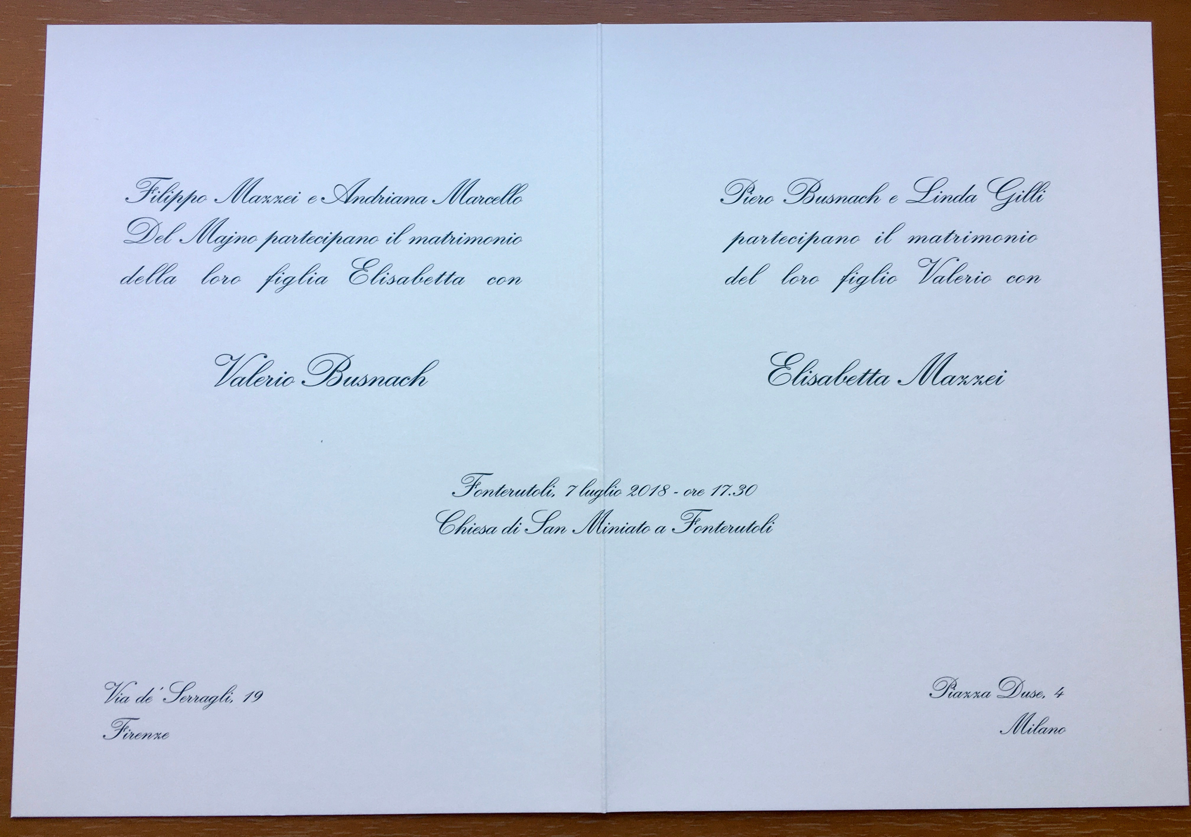
For instance, a so-conceived announcement should be drawn in the following way: up above on the left, the parents “announce” their daughter’s wedding with such and such gentleman; the parents’ names should be written in a slightly smaller font relative to the one that will be used for the newlyweds’ names, and should be placed in a precise order – first, the father, then, the mother with their respective last names, even if they’re separated or divorced. The parents’ status obviously remains if they’re no longer married. So, first names and last names of father and mother, preceding the sentence “announce the wedding of their daughter Maria with”.
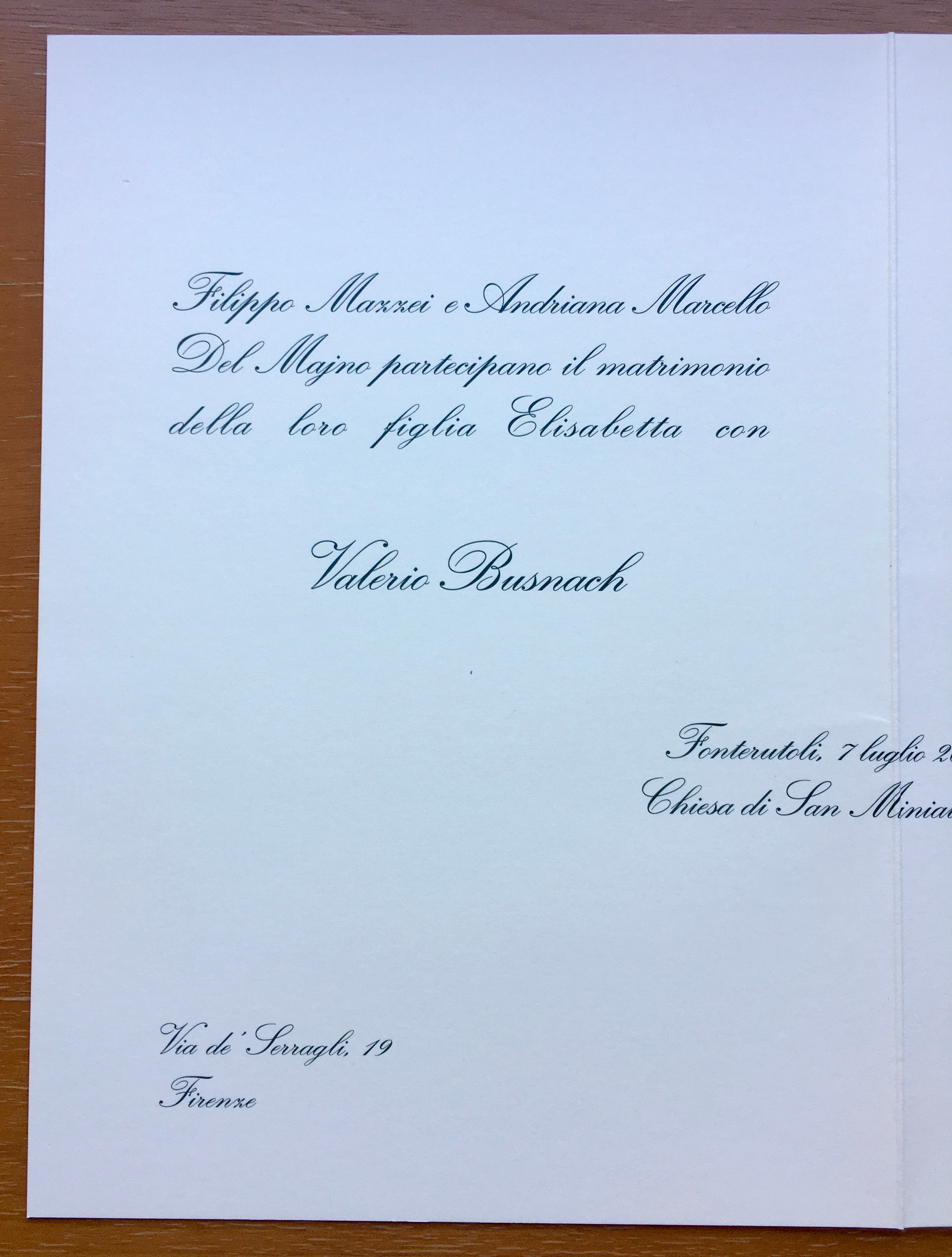
The first and last name of the groom should be placed right beneath, centered and in a slightly bigger font relative to the sentence. Specular, on the other side of the paper, the same sentence referred to the groom: the groom’s parents announce their son’s wedding with such and such miss; with the first and last name of the miss following right after.
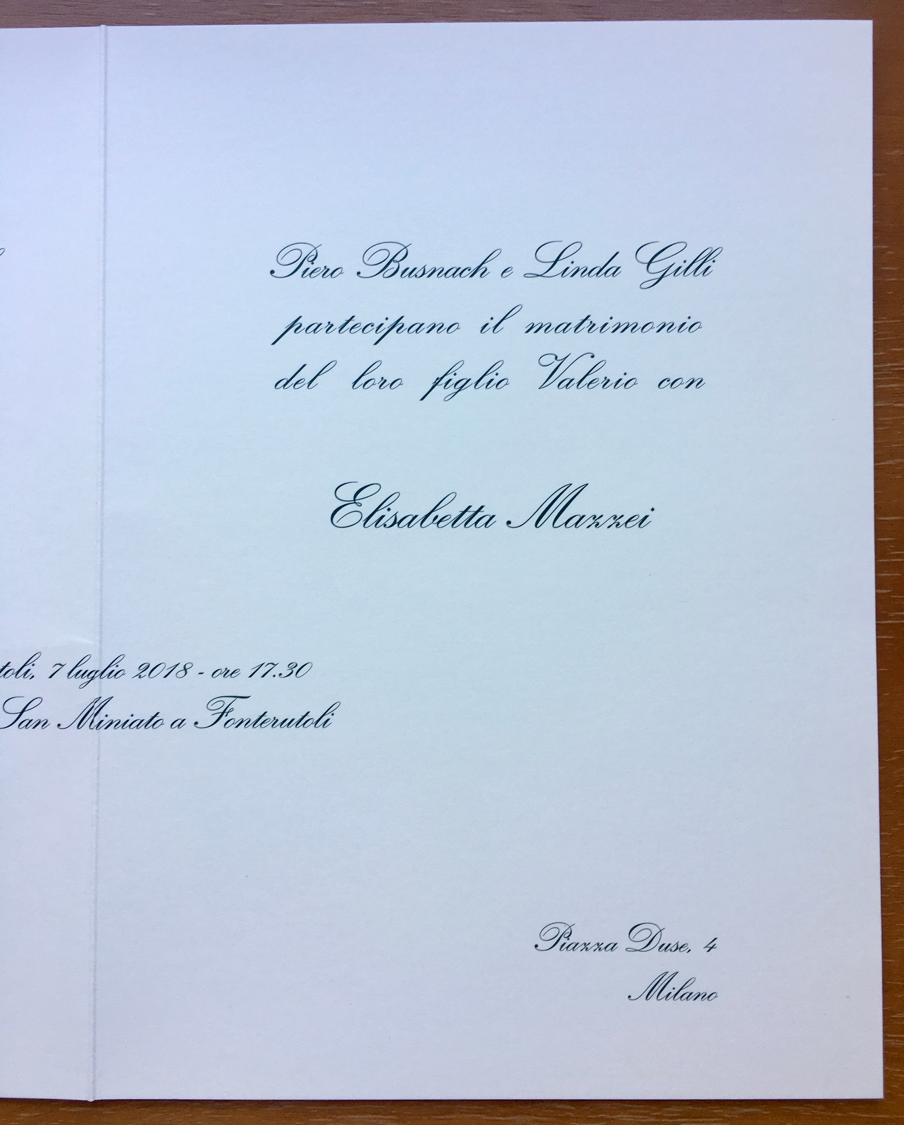
If you picture a folded announcement, what described above should occupy the upper side of the two pages, getting to, once the newlyweds’ names have been included, almost half-way down the page. At the exact center of the two pages you should place the info on when and where the wedding will take place. So, being at the exact center, in the case of the classic folded announcement, the sentence will be folded in two. This last piece of information will include two lines: the first one with the name of the geographical location (city/town), the date and time of the celebration; the second one with the exact name of the venue. For example, “Montecastelli, 7th July 2018 – 5:30pm” on the first line, and “Chiesa dell’Annunciazione in Montecastelli” in the one below, or Milan City Hall, or Rome Temple and so on. These two lines should be written in the same font and proportions as the one used by the parents to announce the wedding.
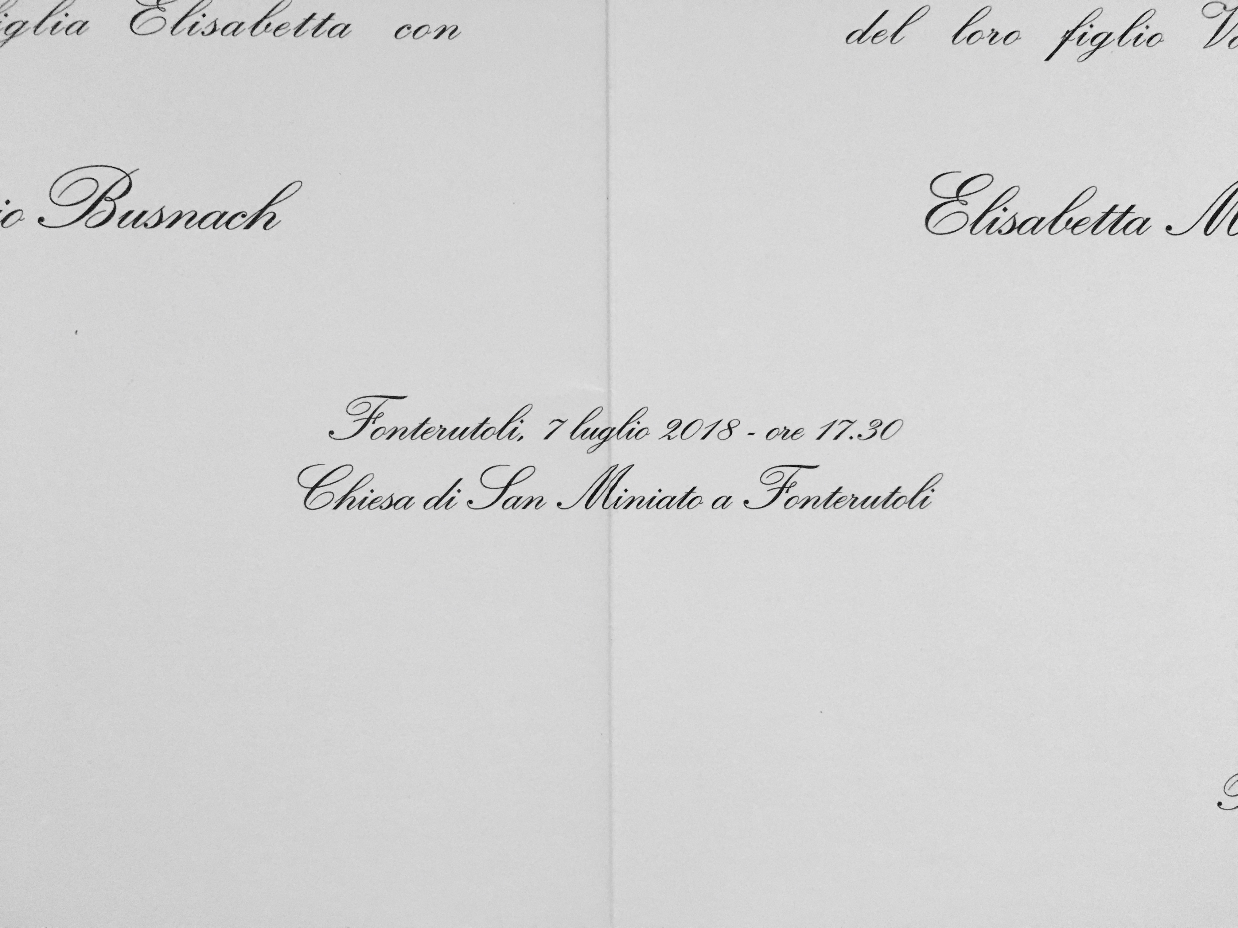
Finally, down below, the two corners should include the two families’ home addresses. It’s very important that these two addresses be those of the original families, not the newlyweds’, even if they lived together before getting married, as the parents are the ones announcing the event. So, the bottom left-hand corner will show the bride’s family home address, whereas the bottom right-hand corner will show the groom’s family home address: street and number above, and city below. The font used for these two last pieces of information is the smallest one on the whole announcement, as it shouldn’t be too visible.
The ultimate goal of this whole game of fonts and proportions is simple: when you receive the announcement, the first things you want to notice are the names of the newlyweds-to-be, as well as the “where and when”. These are the most important pieces of information. Then, on a second reading, you will notice who are the parents and where they live. Also, remember that often times announcements are sent to people who do not know directly the newlyweds, maybe because they are friends with or acquaintances of their parents, and so it’s important for them to know why they’re receiving this communication. Without the parents’ names, they might find it difficult to know who the newlyweds really are.
The reason behind including the addresses is to provide a precise information to those who will send best wishes cards and presents. It even occurred to me to see some invitees bringing their presents to the ceremony and delivering them in the newlyweds’ hands: this is a practice you should avoid by all means, as it embarrasses the couple and creates confusion (inevitably the newlyweds wouldn’t know what to do with those presents right there and then!). When a well-crafted announcement is received, it’s those addresses that all presents should be dispatched to, not delivered by hand, not sent to the newlyweds’ place: only there!
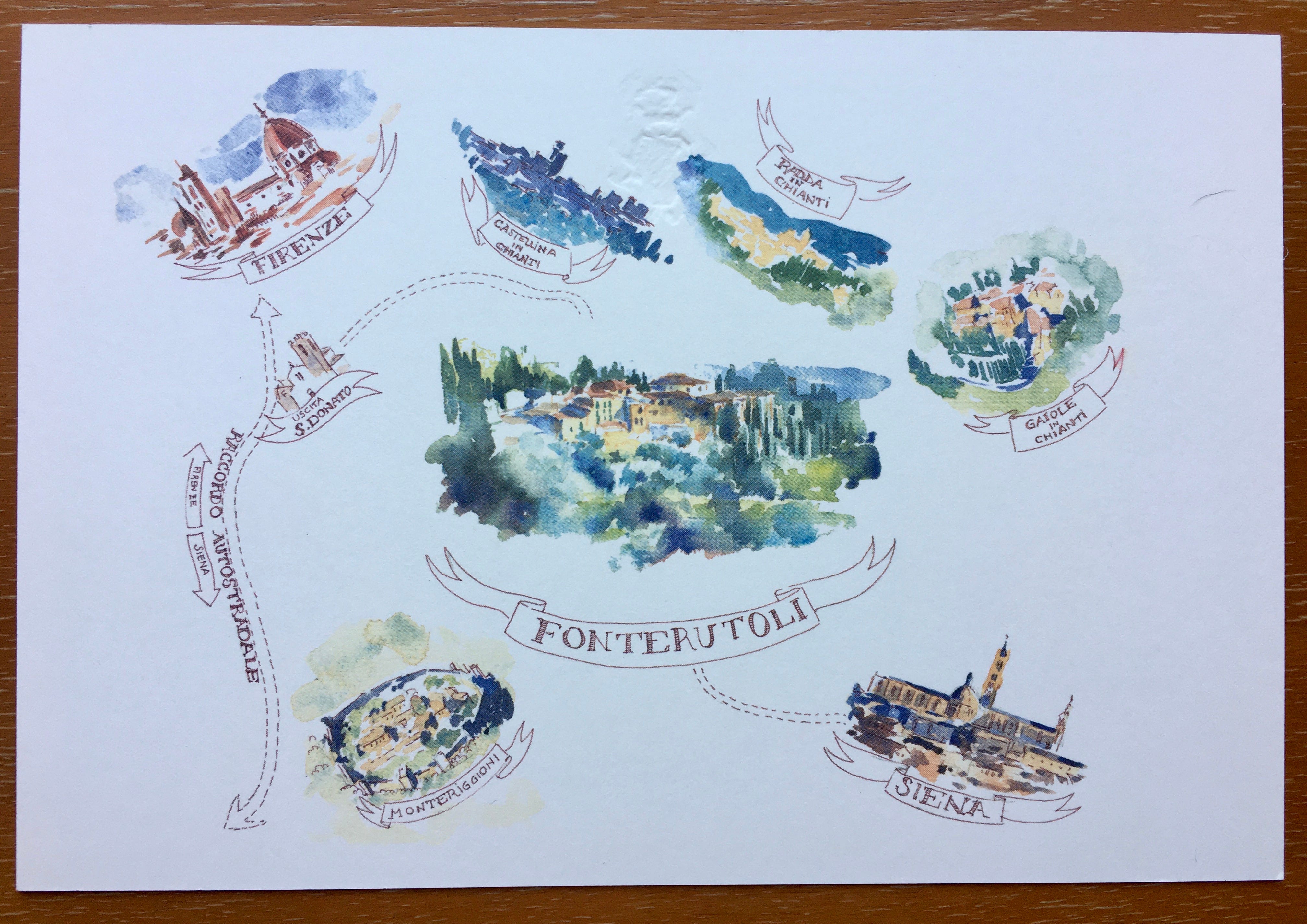
Should the announcement also include the invitation, this one should be drawn up on both sides: on the one side a small map to make it easy to get to the venue (in case it’s not in a city), on the other side the actual invitation, that should be written by following some precise rules.
If the wedding is announced by the parents, they should be the ones inviting, with a caveat: it’s either the bride’s parents or the groom’s parents to invite, not both. Usually, the ones who invite are the bride’s parents, and this is somewhat mandatory when the wedding takes place at home or at a family’s estate/property.
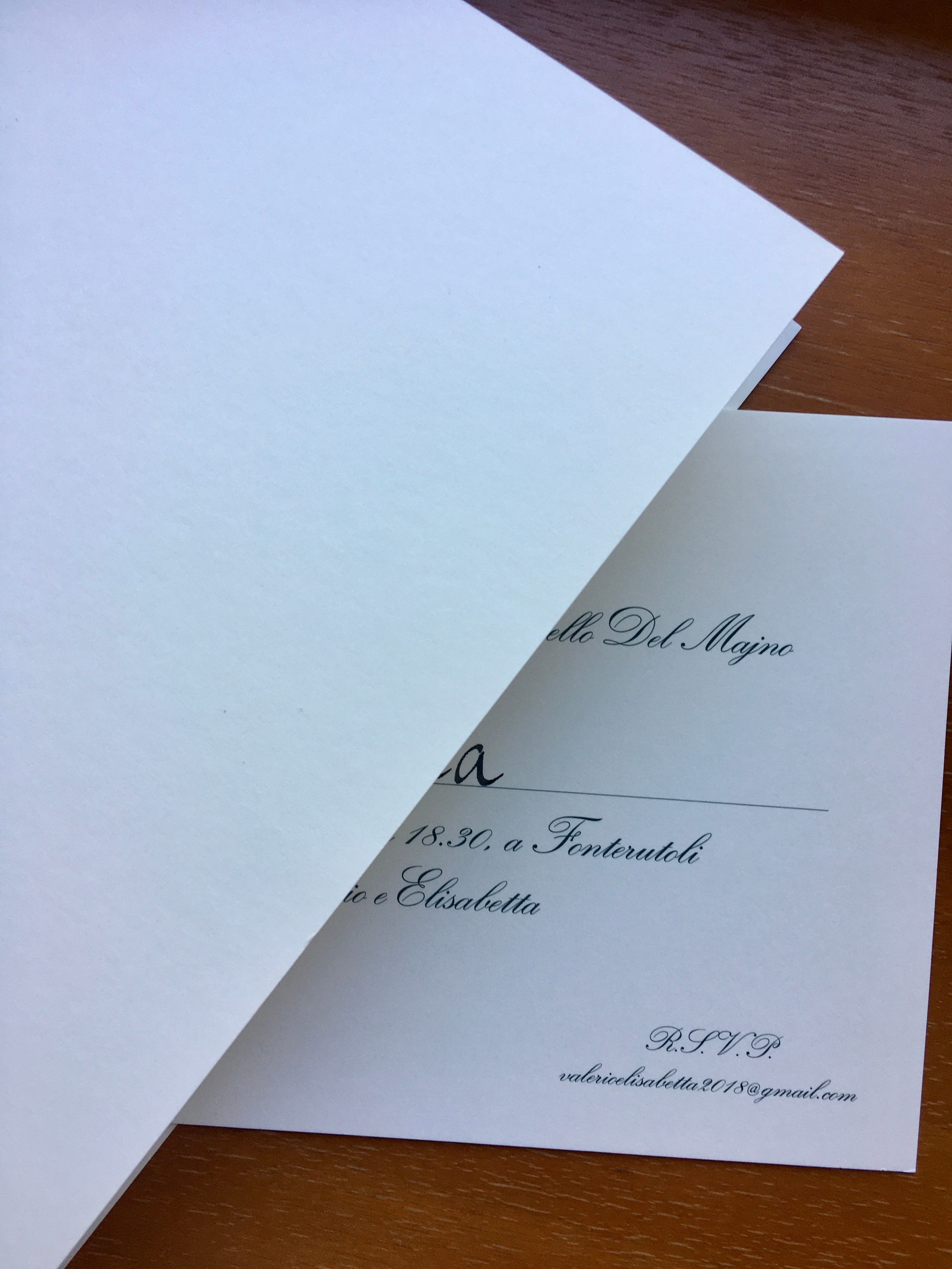
So, up above on the invitation, centered, there should be the line with the parents’ first and last names. Right below that, the second line should only say “invite”, and the third line should include the name of the invitee, this last one handwritten with the same ink and the same calligraphy used in addressing the envelope. But careful: only the first name; no last name.
The fourth line should include the date, time and venue of the reception, while the fifth the newlyweds’ names (as the reception is for them).
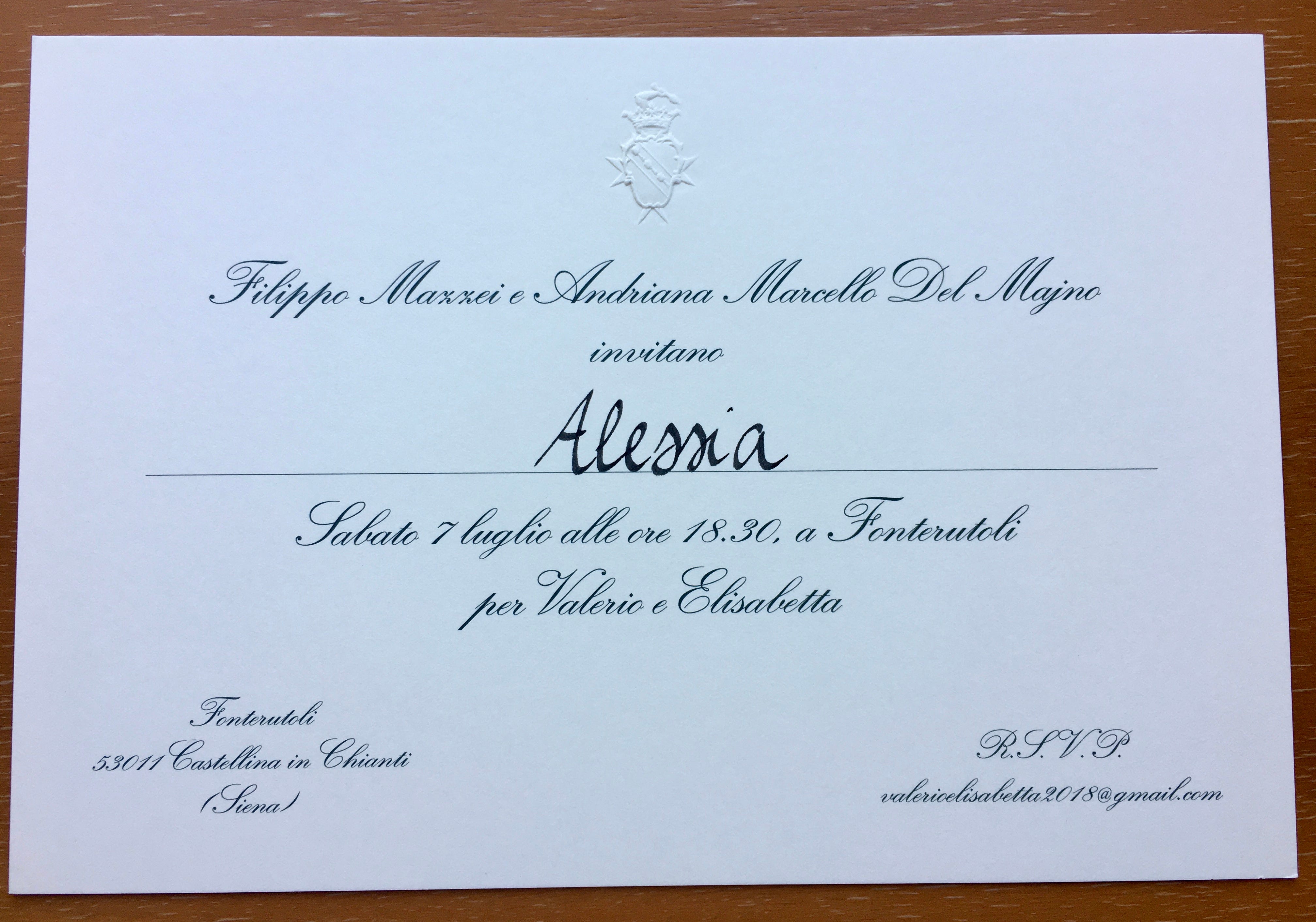
Now to the bottom corners: on the left one a little in-depth info on the venue (already only mentioned in the fourth line), and on the right one the classic R.S.V.P. (Répondez, s’il vous plait), with a telephone number and/or an email address. Even in the most classic invitations, like the one I just described, over the last few years you would be able to find an ad-hoc email address, especially created for the event, where to send the confirmation of your presence: usually the newlyweds create an address with their names and the year of the celebration, followed by .com (or .whatever). The font size for these two pieces of information in the bottom corners should be rather small, but the text for everything else should have a medium-sized font on every line. Only the invitee’s name should be bigger and more visible than the rest.
Lastly, the choice of font (regardless of its size) and color: I’d strongly recommend the so-called English italics, whilst the color should be a dark grey (no black), or, even better, sepia.
It’s all simple and clear, wouldn’t you think?
Write to you next Sunday.
Ciao